


 The biggest difference for me was the capability of creating a contents page, there is a real difference of skill between the two. With the school magazine I found Indesign too complicated so I made the contents on Photoshop, although at the time I thought the school magazine contents page was quite successful, now I look back on it and think that it is quite amateur and there are many things that I would do now instead.
 This was the picture that I started off with and there is quite a large difference between the two pictures, I changed the contrast to make it stand out a lot more, I also took out the background because I wanted the magazine to be plainly about the musician and I felt that the background was a bit too distracting. I also made the violin a brighter shade of red so it becomes a lot more vibrant and I think it would attract the audience. I also cut out parts of the picture to make sure people are solely looking at the musician.
 Overall I think by using photoshop I have made a appropriate front page that people would be attracted to because it is bright and bold and quite clean looking, compared to mainstream magazines that are edgy and dark looking.
 as I had used photoshop on the preliminary task because at that point it seemed a lot more easier to use however it did help with lining up writing and pictures and making columns, when making my double page spread and contents page I combined both Photoshop and Indesign together because I couldn't really edit any pictures on Indesign.

 I attracted my audience by using the vivid colour of green which I think would stand out amongst other magazines. The colour green is quite natural and because folk is associated with country music it makes it quite appropriate to use.
 I feel that my contents page could attract an audience because again the bright colours of green and all of the tabs make it look quite interesting because I found with a lot of people from research that they tend to look past the contents page because they find that there is too much writing and they would rather just read on through the magazine. However I feel that people would read what is actually in the magazine and would address them about what my magzine is about and what it contains.


 As the theme of my magazine was folk I wanted the house colours to be quite "earthy" and natural I tried out the title in many shades of greens,oranges, yellows and reds but the main colour that stood out for me was green because it made the cover look quite fresh and because I wanted to challenge the conventions of magazines I didn't want to go for the typical red and black colours which I noticed many magazines had like NME and Kerrang, therefore I chose a vibrant tone of green which I think has worked quite effectively. I made the title quite thick so it is easy to read, I didn't want the font of the title to be too fancy and distracting from the main act on the page so I went for something simple and noticeable because that was the aim for my magazine- to be seen and be heard by more people. The colour green is seen all of the way through my magazine to make the magazine pages fit together and don't look to mis-matched.
 The magazines that I chose to develop were "Songlines" and "The Fly" which are both online magazines. A way in which I developed these magazines is by making my magazine a product that is sold in stores because I want my magazine to be noticed by people. I have used the some aspects and conventions of "Songlines" because I found their contents page really interesting, with all of the tabs showing which page an article was on, I slightly changed this for my magazine however because instead of using multi colours, I chose a variety of different shades of greens and changed the sizes of the bubbles. I think the mise-en-scene of my magazine has and also used many of the conventions of magazines that I have looked at but I have developed those conventions to fit in with the style of my genre and audience.
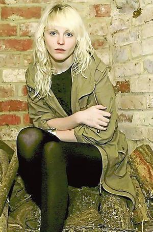
 this is Unthanks which I have based my other band on which are on my contents page. I tried to resemble my band on Unthanks because they are quite young and have the style of music which goes with the magazine.


 On the contents page it consists of only one large picture but not of the actual band who are on the front page which shows that the magazine are trying to put in as many different bands as they can to create more of a variety for different readers, they have also placed the front cover band "The drums" on page 22 which makes people have to read on through the magazine to get to the cover story. The fly have kept their contents very simple with all of the writing at the bottom in one large paragraph. The only way in which they make bands stand out is by making their name in red and the rest of the writing is in black. I don't particularly like this layout because I don't think it makes other people in the magazine stand out and the writing is too small and bunched up together

 Here is a contents page from an NME magazine, I like how it is quite informal because the main attention are the pictures on the page, with little writing underneath describing the act. I like the layout because there are many different column sizes which makes it quite interesting. It is quite simple but bold which is what my magazine is about. This page draws you in to the main article in the centre which is effective because it makes you look at the at the artist and read what it is all about. The "Inside this week" makes it seem quite formal because it almost reminds me of a newspaper article, whereas most magazines dont tend to make the title of the page very big and make it more about what is in the magazine instead.


